 Vessel One by Adam Farlie
Twenty designers including will exhibit sex toys and other objects on the theme of love in Milan next month, during the furniture fair.
Vessel One, designed by Adam Farlie, is the most original one. It's a bed that asks whether an object can become a substitute for a person. Vessel One was created to replace absent people through sound. This object is always listening, constantly recording the sounds made by those who have lain on it. Designed as a sensitive vessel that captures and contains the ‘audio-memories’ of past occupiers through sound. when Vessel One detects silence, it plays back sound memories at random. Sounds are recalled in the bed in the same way a Memory pops into the mind. One might lie in bed and hear past intimacies, infidelities or conversations from a number of days, weeks or even years ago. Vessel One is made of Corian.
Adam Farlie graduated in 2008 from the Design Academy Eindhoven. He specialises in emotional design. He lives and works in Eindhoven, The Netherlands.
[Photo ⓒ Adam Farlie]
• SEE THE OTHER CREATIONS AT THE LOVE DESIGN EXHIBITION
First is the whole environment where this architectonic project is build, a green area, full of trees and just the sky to watch. It moves and it's called the Sliding House. It's an amazing home created by London architects studio dRMM. The brief was simple: to build a house to retire to in order to grow food, entertain and enjoy the East Anglia landscape. The outcome was as unconventional as they come. A structure that has the ability to vary or connect the overall building's composition and character according to season, weather or simply a desire to delight. The part-prefab home consists of a glasshouse, main house, open space and annexe aligned on a track. A garage, off the track, adjoins the open space, creating a courtyard. This is a video from Wallpaper* Magazine who captured the physical phenomenon in the only medium that serves it justice - film. See by yourself and give us your opinion. We know that Macau is not the spot for these wonders but anyhow we dream with such a place. EXTRA LINKS:
• dRMM Website
• Sliding House at Dezeen
• Detailed project in PDF
• At bdonline
• Stephen Bayley writes about it on The Observer
• Finally another great one!
[CLICK ON THE IMAGE TO SEE THE VIDEO © WALLPAPER*][BACK TO BLOOMLAND]
 If you are looking for the best speaker system to pair with your mobile sound device, Zikmu is the choice to make.
Zikmu is the product of the association between the leader in wireless mobile telephony devices Parrot and the awarded designer Phillipe Starck. The system is a set of 2.5 feet tall speakers that use Bluetooth to communicate with each other. Thanks to Parrot's NXT technology they are able to relay sound 360° arround the room , using an extra-flat mebrane to create small-scale vibrations across the speakers' entire surface.
"We were not aiming to create just another speaker," says Philippe Starck. "Our design focused more on making the air vibrate. There is actually a three-dimensional feel to this vibration, meaning that the air is palpable, almost humanlike in presence, like a fragrance."
They're not around yet, you still have to wait untill Spring. In the meantime you can start to save your money because this combo will cost around 12 000 HK$ (1.500 US$). The good news is that you're not buying just an extreme sound quality for something you use everyday but also a work of art on a unique piece of design that you can always be proud, just for looking at. [SOURCE: ECOUSTICS]
• PRE-ORDER OR ASK A QUOTATION AT BLOOM BY THROWING US AN EMAIL.
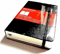
 After the success of the limited edition Red diaries, we are excited to announce Moleskine has introduced the Classic Red Notebook Collection, the second incursion of Moleskine into the world of colours. Moleskine Red Notebooks will be available for the two most popular layouts, ruled and plain; and in 2 sizes: pocket and large.
BE STYLISH IN RED
The Red Notebooks of course include the durable oilcloth bound cover binding and acid-free paper pages, the built-in elastic closure, the ribbon placeholder and the cloth-covered expandable inner pocket: all the details that make the classic Moleskines a true icons.
Black or Red: coordinate the classic Moleskine notebook to your mood!
ORDER THE NEW MOLESKINE RED AT BLOOM!
SUPPORT BLOOM! WE NEED YOU!
[DOWNLOAD INFO] [SEND US AN EMAIL HERE FOR MORE INFORMATION]
BLOOM IS THE EXCLUSIVE DISTRIBUTOR OF MOLESKINE PRODUCTS IN MACAU


At Bloom we are always with an eye on the future. Now, more than ever. For instance we're following since the start the fabulous eInk project and its forming devices. We believe that that's one of the ways of the future of publishing industry. But now there's a new scene on the block. Code named "Brick", following the same idea of the version 2 of the One Laptop per Child (OLPC) project by the designer Yves Behar, shown here, the "Brick" is an all screen laptop projected by Apple Computers. The upgrade of the OLPC it's something that combines the touch feeling of a iPhone and the use of a normal notebook computer. The concept is the same, a computer that can be used by kids all over the world costing around 100 US$.
Nobody know how's the mac version will come to life, and how will be shaped, but will be something completely different from what we know. Apple’s feverishly-anticipated “Brick” project is the world’s first all-screen laptop. There’s slim chance, of course, but I for one would love a computing device like this: A hybrid iPhone-meets-Macbook-Air that would put hot netbooks like the EeePC to shame.
Apple’s “Brick” would be a hybrid laptop/tablet/ebook that dispenses with a physical keyboard and trackpad in favor of a virtual, adaptive UI that blends multitouch, gestures and its own orientation to switch between different modes: Laptop — When the Brick is held horizontally with the two screens at an angle, the bottom screen turns into a virtual keyboard and touchpad. There’s no tactile feedback for touch typists, but never mind, corrective text handily makes up for the myriad errors. The top screen acts like a regular laptop screen, except that it also is touch sensitive, and is responsive to multitouch gestures like double-tap to zoom, pinching and scrolling.
Tablet — When the two halves are opened fully they snap together in the middle to make a tablet with a continuous touch-sensitive screen. This mode is best for surfing the web, browsing and editing photos, and displaying mind-altering music visualizers.
eBook — Like laptop mode but held vertically. Each screen transforms into an electronic page for easy reading. Displays eBooks, eMags or specially laid out websites. Readers navigate by swiping the screen to turn the pages.
Tabletop — Like tablet mode but for two people. When an onscreen button is pushed, the screens are oriented for two users sitting opposite each other. Great for collaborative tasks and especially games.
And why’s it called “Brick”? Because it smashes Windows! ;-)
[WATCH YVES BEAR AT TED.COM] [SOURCE: CULT OF MAC & TED.COM]
 Recently published and available at Bloom Yellow is the quarterly issue of ARTICHOKE, the official magazine of the Design Institute of Australia. Interesting, relevant and sometimes controversial, ARTICHOKE communicates good design and the discussion of design issues to industry professionals and a broader audience of design aware consumers.
ARTICHOKE covers interior architecture and design, textile design, product design, exhibition design and graphic design, and provides designers with news and information on current trends and projects, and is published four times a year.
ARTICHOKE is endorsed by the Design Institute of Australia (DIA) and the Australian Institute of Architects.
See some sample print pages here and come to Bloom to buy it, we can tell you is worth every dime spent. Good photos, good design, good texts and a beautiful piece of printing material.
ARTICHOKE MAGAZINE • AVAILABLE AT BLOOM NOW!

 Everyday objects in an all-new, extraordinary way!
Every day we use dozens of small objects, from teabags to paper clips to tweezers. If they work well, the chances are we don’t pay them much attention – but life would be unthinkable without them. Although modest in size and price, these objects are true masterpieces of design.
This visual feast portrays one hundred fabulous objects, from bubble wrap to Zippo. Brief, informative descriptions accompany stunning photographs of each object, detailing the little-known history of some of our favourite things.
DID YOU KNOW:
• That M&Ms were used by soldiers going into battle who needed a quick pick-me-up (hence their durable sugar coating)?
• That the amount of wire used to make Slinkys since 1943 could wrap around the earth 126 times?
• That Salvador Dalí designed the famous daisy pattern on Chupa Chups lollipops?
ABOUT THE AUTHOR
Paola Antonelli is a curator in the department of Architecture and Design at the Museum of Modern Art in New York and was recently rated as one of the top one hundred most powerful people in the world of art by Art Review.
[MORE HERE]
Humble Masterpieces: 100 Everyday Marvels of Design, by Paola Antonelli
THAMES AND HUDSON • PAPERBACK WITH FLAPS • 216 PAGES • FIRST PUBLISHED 2006 • AVAILABLE NOW!
Filipa Simões apresenta exposição “Why?” no Centro de Indústrias Criativas
Pergunta com resposta(s)
No início de tudo, há sempre uma questão que se coloca. O cliente encomenda um trabalho, explica o que tem em mente e aquilo que pretende. Compete, depois, ao designer gráfico, encontrar a resposta mais acertada, transformar conceitos em imagens, apurar possibilidades que vão aparecendo à medida que se explora o objecto. O resultado é a comunicação. O resultado ideal é a comunicação sem ruídos, mas que foge ao óbvio.
“O design está neste processo de encontrar respostas. Coloca questões e abre possibilidades”, explica Filipa Simões, designer gráfica, comunicadora por imagens, por natureza e formação profissional. Na próxima sexta-feira, quando forem 18h30, no Centro de Indústrias Criativas, abre ao público a exposição “Why?”, em que a designer explora, precisamente, as respostas para uma “inquietação”, desta feita lançada por ela própria e não pelo cliente. “Há já algum tempo que queria fazer uma exposição”, conta Filipa Simões. A oportunidade surgiu, através do Centro de Indústrias Criativas, que lhe lançou o desafio. A autora da instalação de vídeo “Insaciedade”, construída em 2005, ainda ponderou a hipótese de voltar a usar este meio de expressão. Mas a opção que pesou mais acabou por ser outra. “Decidi fazer uma exposição de design de comunicação, que é a minha disciplina”, afirma.
Em “Why?”, Filipa Simões faz um “exercício de experimentação, de liberdade criativa”. A partir das três letras da palavra e do ponto de interrogação explora soluções gráficas de comunicação. Quem for ao Centro de Indústrias Criativas vai poder ver como se desenvolve o trabalho de um designer gráfico, as várias fases do processo, desde que se coloca a questão até que se encontram hipóteses de solução do problema.
“’Why?’ é o porquê das coisas e o porquê do design. É um ponto de partida para comunicar”, descodifica. “Peguei nesta questão e fiz um exercício gráfico, explorando plasticamente vários caminhos e hipóteses. Joguei com esta ideia simples, com várias imagens e sensações, que focam um caminho.” Nesta exposição, a designer mostra a tal inquietação que a procura das respostas implica, mas permite também, ao público em geral, perceber melhor o mundo da comunicação visual. Serve ainda, acredita, para abalar convicções em torno desta área de trabalho.
“O design gráfico é frequentemente encarado com um serviço”, analisa Filipa Simões. E isto deve-se ao facto de ser uma área com uma componente mais prática e imediata, mas também pelas condições em que, muitas vezes, é executada. “Com frequência, os trabalhos são feitos com muita pressa, exigem-se soluções rápidas, pelo que se pode dar menor importância.” Quando existe o tempo necessário para lidar com as inquietações, acontece um “exercício maior” e a arte conquista espaço. “É a arte de comunicar”, conclui.
Com “Why?”, o público pode ficar a perceber processos de construção e reflexões em forma de imagem, mas o trabalho acaba por ter um efeito semelhante para a sua autora. “Fazer este exercício abriu uma série de possibilidades, mesmo em termos artísticos, e fez-me encarar o trabalho de outra forma. Tem sido óptimo”, conta.
A exposição no Centro de Indústrias Criativas é um momento especial para a designer portuguesa. “Tenho vindo a fazer o meu trabalho muito discretamente e quero que as pessoas o conheçam, pelo que estou muito satisfeita com a oportunidade.” As imagens que constituem a “Why?” podem ser vistas até ao dia 3 de Março. RETRATO DA ARTISTA
Filipa Simões nasceu em Portugal, em 1978, tendo vivido em Macau entre 1989 e 1992. Se bem que breve, a experiência no Oriente foi marcante, ao ponto de sentir vontade de regressar, o que acabou por acontecer em 2004. Antes de rumar, de novo, ao território, tirou o curso de Design de Comunicação na Faculdade de Belas Artes da Universidade de Lisboa.
Foi em Portugal que começou a desenvolver projectos de identidade editorial e corporativa, na empresa Forma Design. Já em Macau, trabalhou na editora Livros do Oriente, onde teve a seu cargo a concepção gráfica de várias publicações.
Em 2005, criou a sua própria empresa, a WHYDESIGN, tendo, desde então, concebido e executado projectos na área da identidade corporativa, do design editorial, web design e multimédia, design promocional e publicitário, eventos e exposições, design de embalagens e produtos, tanto para clientes locais como de Portugal.
Tem participado em vários concursos internacionais e locais, com prémios arrecadados. Em 2004, foi distinguida com o primeiro prémio do logótipo do Conselho das Comunidades Portuguesas, por um trabalho feito em conjunto com o arquitecto Nuno Soares. O logótipo acabou por ser seleccionado para representar Macau no livro “Worldwide Identity”.
Mais recentemente, e numa lógica de ligação ao território bem presente na sua concepção de design, ganhou o primeiro prémio do logótipo da Confraria de Gastronomia Macaense.
Na área do vídeo, outro meio que Filipa Simões emprega para comunicar, marcou presença na Experimentadesign 2005, em Lisboa, com a instalação de vídeo “Insaciedade”, um retrato de Macau da perspectiva dos restaurantes locais.
Mais recentemente, os trabalhos gráficos para as peças de mobiliário da série “constrAction”, desenvolvida por Nuno Soares, estiveram em exposição em Hong Kong, no ID Expo 2006, e em Milão, no Salone Satellite 2007.
[POR ISABEL CASTRO • TAI CHUNG POU EM PORTUGUÊS]
"Why?" • CENTRO DE INDÚSTRIAS CRIATIVAS • CENTRO CULTURAL DE MACAU • DE 15 FEV A 3 MAR


 Agora que os cigarros se tornaram proibidos dentro da maioria dos espaços públicos em Portugal, surge a necessidade, para quem fuma e para quem quer continuar a fumar, nos cafés, nas discotecas, nas boutiques, de criar soluções que contornem esta norma, e assim ficam todos contentes.
O Smoker Bell é uma das alternativas para continuar a fumar enquanto se bebe uma cerveja sem necessidade de evasão para um espaço ao ar livre. É um projecto da designer Florian Brillet e pode ser encontrado aqui. Fica de certeza muito bem na Ginginha do Rossio.
 (Click to zoom)
The goal is to join citizens and artists together in order to raise awareness to the high rates of abandoned animals in the streets of Macau (consult data here). Responsible ownership and respect for all forms of life is the final message to all of us. It's our duty!
This subject needs attention from everybody, so why not stimulating the care for our pets through something nice, fun and where you can release all your creativity? Join the competition! It's for a very good cause and there are prizes too!
There are 2 categories: students and general public. Find all details and download application form here.
 Unite For Children
60 artists and graphic designers from all over the world (19 countries) are gather together on behalf of Childhood.
With the objective to inspire the creativity and the commitment to every human being and to participate on the UNICEF's actions. This cultural and social project, realized by APAG Editions with the partnership of UNICEF, goes beyond the ambition of any other book.
"In December 2006, UNICEF celebrated its sixty years of existence. We wanted to avail ourselves of this anniversary to pay homage to this institution through the making of the present book. To that end, we contacted sixty recognized or up-and-coming artists and digital designers from every corner of the world, whom we invited to join in our project.
Our initiative found an echo among them and they kindly agreed to participate in it, convinced that Childhood is worth illustrating, as pictures may sometimes have a stronger impact than words. However, the project's goal has never been to realize a commercial catalogue but definitively a graphics creation anthology.
That is why all potential participants have been selected by APAG members behind the project and by professional in graphics community on very specifics criteria. Our intention was to vary as much as possible the graphic styles appearing in this book.
With this in mind, we approached designers from diverse crafts : advertising, cinema, comic strips, webdesign, photography..."
Through 180 pages, you will discover various creations, some of them will be abstract, others more explicit; some will be radiant, others dark and pessimistic. Given that each artwork corresponds to the picture its author has of the world, it is obvious that all of them cannot reflect every artist’s ideal. The pages express the feeling about each artist and their work. As a "philosophical aspect" each work comes with a short text from its author.
MORE HERE: www.60uniteforchildren.com
[SOURCE DEXIGNER.COM]
 «To make a visual work succeed, both sides need to be satisfied — the creator and the audience. It’s very important that when an audience sees a work, they respond. They should really feel something from the bottom of the heart. Not like, “Oh, that’s so cool,” but a real emotional touch. If you as the creator feel that same emotion, it becomes complete. That’s what makes a work succeed.»
Qian Qian
Esmeraldas, açafrão, papagaios e velhas vinhas
0 comments Semeado por / Sowed by: Bloom * Creative Network at 15:54 Este é o novo título da Editora Livros de Areia, A Sereia de Curitiba de Rhys Hughes. Vai ser apresentado esta semana numa série de enventos que contam, como não poderia deixar de ser, com a presença do autor nascido no País de Gales. Têm início na próxima Quarta-feira em Lisboa, às 14:30 na Faculdade de Ciências Sociais e Humanas da Universidade Nova de Lisboa (para uma sessão com alunos e professores); às 19:00, no Café no Chiado, para uma sessão de leitura englobada no programa cultural deste espaço, pertencente ao Centro Nacional de Cultura. E nos dias seguintes com duas sessões distintas: no British Council, entidade que apoiou esta edição, Quinta-feira às 19:00, com a apresentação de José Mário Silva. E na Sexta-feira, já numa Livraria, na FNAC do Colombo, com o leme a cargo de Fernando Alvim.
Como refere o seu tradutor "é um livro feito com muito empenho por uma pequena equipa composta por escritor, editor, tradutor, ilustrador e revisor. E neste caso, o resultado foi um livro inestimável recheado de absurdo e imaginação mas também muitos toques de sensualidade, sentido de humor e uma vontade de abraçar o mundo e deixar-se abraçar por ele."
Rhys Hughes escreveu o livro a pensar especialmente na tradução para português, língua em que será unicamente publicado. É um livro fantástico de contos inspirados na síndrome de ser português e lusófono. Ou, por outras palavras, é um livro de contos fantásticos bebidos na passagem do autor pelo nosso país e também pelo Brasil. Ou terá sido embebido? Já não sei dizer. Fica aqui um excerto.
E chega deste disparate de “querido leitor”. Não há nada de querido sobre mim. Tenciono ser reles a partir de agora, o mais reles possível que conseguir ser, e isso é uma outra forma como tenciono arruinar o vosso paraíso vistoso. Arrebatamento terno num clima aromático, fazer amor nas ondas e comer cocos? Pah! Cheguei à idade de (escrever em lápis para que possa ser alterado mais tarde) e nunca fiz isso ainda, logo, não vejo razão porque tenho que me sentar aqui, submisso, e ler sobre isto, sem me infiltrar. Nem pensar! Você esperava realmente aparecer e não fazer os seus leitores invejosos? É assim tão estúpido? Porque se não é, então queria deliberadamente magoar-nos, e nunca nenhum simplório irá ser eleito como Chefe da Ilha do Beijo Picante.A não perder. As sessões de apresentação e o livro, claro. A Livros de Areia está presente em quase toda a sua extensão nesta praia chamada Bloom, um pedaço de terra cheio de céu ao seu serviço. Vamos agora comprar um bilhete, só de ida, para esta Grande Sereia.
A Sereia de Curitiba, de Rhys Hughes
LIVROS DE AREIA • OUT 2007 • TRADUÇÃO DE SAAFA DIB • DESIGN DE PEDRO MARQUES SOBRE ILUSTRAÇÕES DE PAULO BARROS


The mexican designer is Victor Aleman, the concept is an adaptive floor seating that tunnels the way you want and loops into something you dreamed when you were a kid. It looks like a large chunk of orange peel you dropped to the floor. Made from a single piece of red oak, the Loopita is covered in high density foam for comfortable seating. The two opposing end points makes for a great floor level chaise. Add several Loopitas together can form interesting modular seating arrangements. Dynamic and striking.
[MORE AT YANKO DESIGN]
 Kelvin investigates today’s evolving perception and application of colour. Structured into chapters that each focus on a single colour, the book documents some of the effects of the deliberate use of colour in recent top quality design work. Alongside images of clear and distinctive colour allocation, Kelvin also includes more intricate and playful examples that illustrate contemporary colour combinations. This ensures that the reader is introduced to the subject of colour in an instructive as well as an associative and experimental way.
Colour currently plays an increasingly significant role in global visual communication. More than ever, colour is being deliberately utilized to give design projects, campaigns and brands their own distinctive style. Astonishingly until now hardly any publications exist that investigate today’s evolving perception and application of colour.
Colour, more specifically colour temperature, is measured in a unit called the Kelvin. The book Kelvin identifies which possibilities exist for the conscious use of colour. Each chapter relates to a colour: green, red, blue, yellow and orange as well as the achromatic “colours” black and white.
This comprehensive book contains recent, top quality design as well as exciting projects from photography, illustration and product design that work with colour in remarkable ways. In addition to images of clear and distinctive colour allocation, Kelvin also includes more intricate and playful examples that illustrate contemporary colour combinations. This structure ensures that the reader is introduced to the subject of colour in an instructive but also in an associative and experimental manner.

Each chapter in Kelvin starts with an essay or interview that puts the selected works in that section into context. The book also investigates complex subject areas such as classic colour theory, the meaning of colour in various cultures and the effect of colour in brand management.
With its current examples of striking creative work and insightful analysis Kelvin offers both usability and inspiration for professionals such as graphic designers and design studios but also anyone working in the fields of fashion, interior design, lifestyle and art.
Kelvin - Colour Today • Editors: R. Klanten, B. Br
PUBLISHER dgv* • ISBN: 9783899551969 • 24 x 28 cm • 320 pages • AVAILABLE SOON
[* Die Gestalten Verlag (dgv) specializes in developing content for aficionados of cutting-edge visual culture worldwide. The company is best known for the more than two hundred fifty books we have published that document and anticipate vital design movements for our own title list as well as customer publishing projects. dgv also provides curation, art direction, consulting, production, distribution and design services to international clients such as Volkswagen and Diesel. Always working directly with talented young designers and artists, dgv brings a deep understanding of visual culture on a global level to whatever we do and remains firmly committed to presenting visual trends with timeless substance. Our name provides insight into its philosophy: "die gestalten" is a German pun meaning both "the creatures" and "they design.]
 What's your sign?
The world's best logo designs
Everybody knows that brand identity is key. A good logo can glamorize just about anything, so it comes as no surprise that logo design is a crucial step in the development of a product or service.
This exhaustive guide brings together diverse logos from over 30 countries, organized into chapters by theme, such as media, retailers, events, regions, service and agencies. A full index provided at the end of the book lists each logo's company, designer, and designer's website. Also included is a case study section, concentrating on logo application and development.
No graphic designer can do without this book, and anyone who's interested in design will appreciate this diverse compendium of visual ideas. As scientist Linus Pauling once said, "In order to come up with one good idea, you must have lots of ideas."
ABOUT THE EDITOR
Julius Wiedemann was born and raised in Brazil. After studying graphic design and marketing, he moved to Japan, where he worked in Tokyo as art editor for digital and design magazines. Since joining TASCHEN in Cologne, he has been building up TASCHEN's digital and media collection with titles such as Animation Now!, Web Design: Best Studios, and TASCHEN's 1000 Favorite Websites.
Logo Design, Julius Wiedemann (ED)
Softcover + elastic ribbon • 384 Pages • ISBN: 9783822846223 • 2007
 New at Apple isn't just the iMac, there is much more.
First is the new iLife 08. The package that includes photo, movie, music and web edition. It's a small piece of software that turns yourself easily into a multimedia expert. Mac software is so user friendly that just needs a second to get you started.
iPhoto automatically organizes your photo library and makes editing as easy as clicking your mouse. EVENTS is a new way of packing all your images in terms of storage and search, grouping your photos together. You can identify all your Events quickly by a name and poster photo (which is simple to change). It gets much more simple to find your best images and to print them into multi-output forms or to share them easily on the web. [WATCH VIDEO]
In addition you can use iMovies for video edition, completely redesigned to help you make movies in minutes and make a shortcut in time, working with video as intuitive as enjoying your photos. [WATCH VIDEO]
iWeb is just a great way to create your website exactly as you want and play your creations world wide at the top of your finger. [WATCH VIDEO]
Then comes Garage Band, your personal recording studio and a world apart. Music, podcasts and yourself on stage. Do I work for Apple? Is just what it seems. The truth is that we want to get into those toys. We want to have Apples at Bloom and turn your interactive experience as you never seen before. Why not to make a change and add an i to your life? [VIDEO FOR GARAGE BAND].
Don't forget to check the new online service, the .Mac Web Gallery, and the iDVD and you have the complete iFamily. Ok, two more lines on the other update, the new iWork'08. Inside there's Keynote, for stunning cinema-quality presentations; there's Pages, the streamlined word processor for great publishing design; and the completly new Numbers, the revolutionary spreadsheet application from Mac. Try it! I assure you that your clients, your friends, your mom will be very proud, because your work will look much beauty fool™.
We'll keep informed about Apples at Bloom.


 [www.apple.com/imac] [more info to follow]
World Heritage Product Fashion Show Macau Tower Convention & Entertainment Centre - Level 4
Tomorrow, June 30 – 15:00
As part of the first “Macao Apparel Week”
The show sets a great example of Macau’s unique value. With its legacy of more than 400 years of mixing cultures, where the East joins the West, creating an all set of experiences. The examples of this understanding can be seen through many great manifestations. On architecture, on food, on language, on music, streetscape and cultural forms.
In 2005, Macau entered the World Heritage List. Through this show we relive this interchange of culture, bringing designers from different practices and areas to the same stage. From Fashion, Architecture, Product and Graphic Design, Music and Video. Despite the use of different forms they share the same goal to celebrate Macau: A Historic City. We hope through this event we can bring more and more people to share the same experience we practice everyday.
Organized by The Association of Advertising Agents of Macau and co produced by +853 Cultural Association.


 Posts
Posts






![[zoom in]](http://bp3.blogger.com/_jduB4Xpp9eU/RyDDY8eSh-I/AAAAAAAAArg/L_Fre_nCXYs/s1600-h/BloomMapS.jpg)